You can design your own page layouts. Due to space limitations, elements can only be displayed one below the other in the mobile version.
¶ Step 1
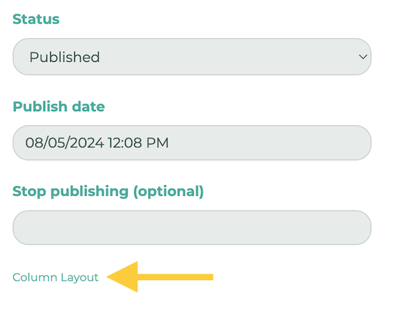
Edit the desired page using the pencil icon, then scroll down. On the right, click Colum Layout.
¶ Step 2
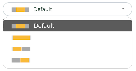
Now, select a layout.
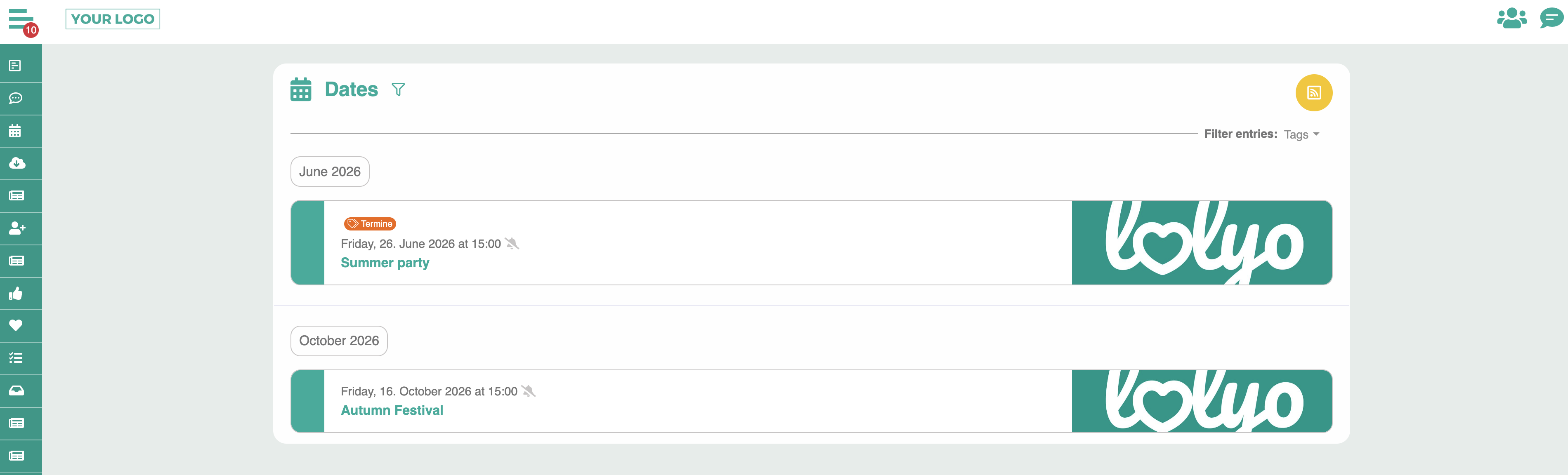
¶ Wide layout
The side elements use more horizontal space and fill the screen more widely.
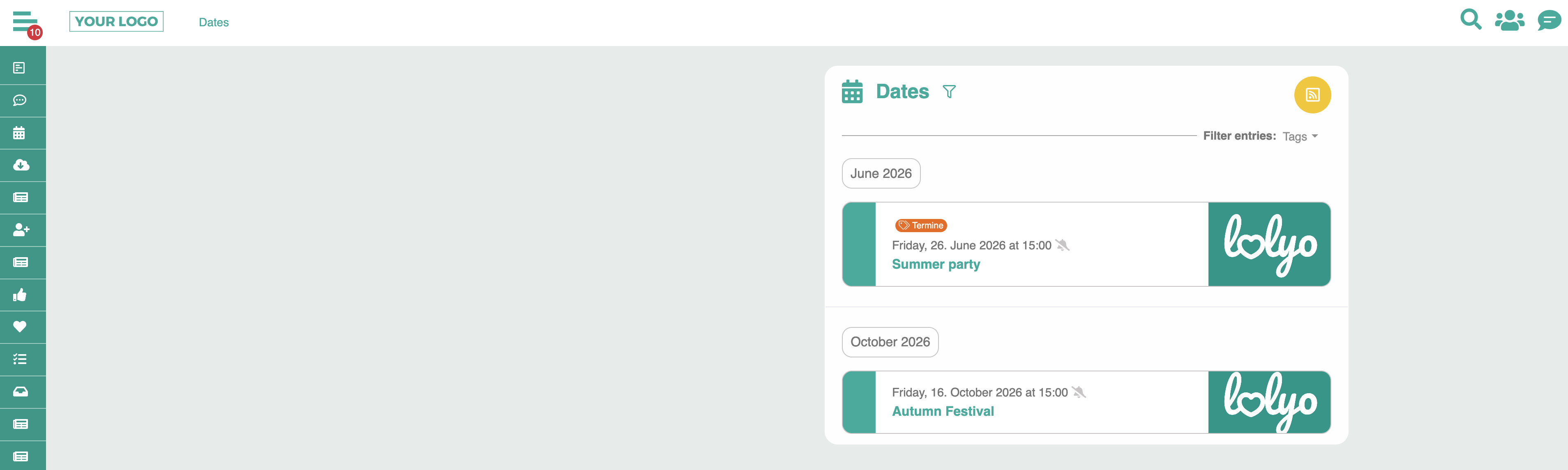
For example, take a look at the event page: The content is displayed more widely and uses more screen space.
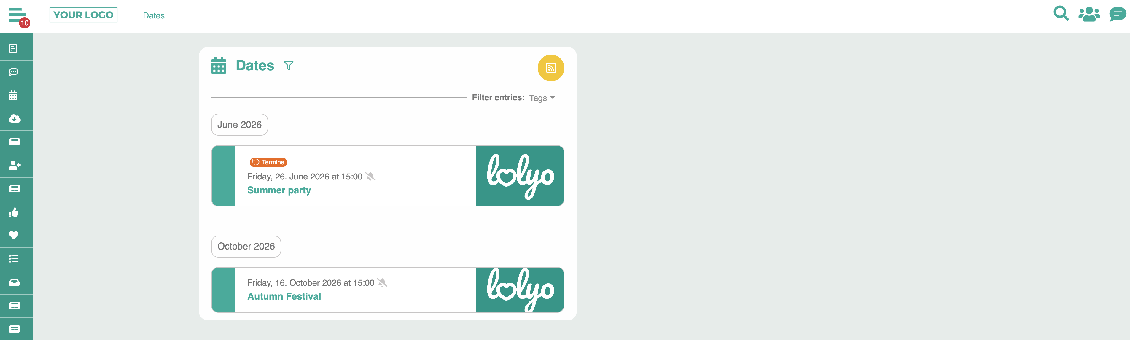
¶ Alignment: Left
The side elements are aligned to the left.
¶ Alignment: Right
The side elements are aligned to the right.
¶ Design the layout
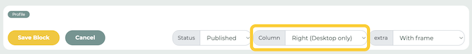
With layouts that are left- or right-aligned, you can display elements next to each other. Edit the respective element and select the opposite of the layout in the Column field.
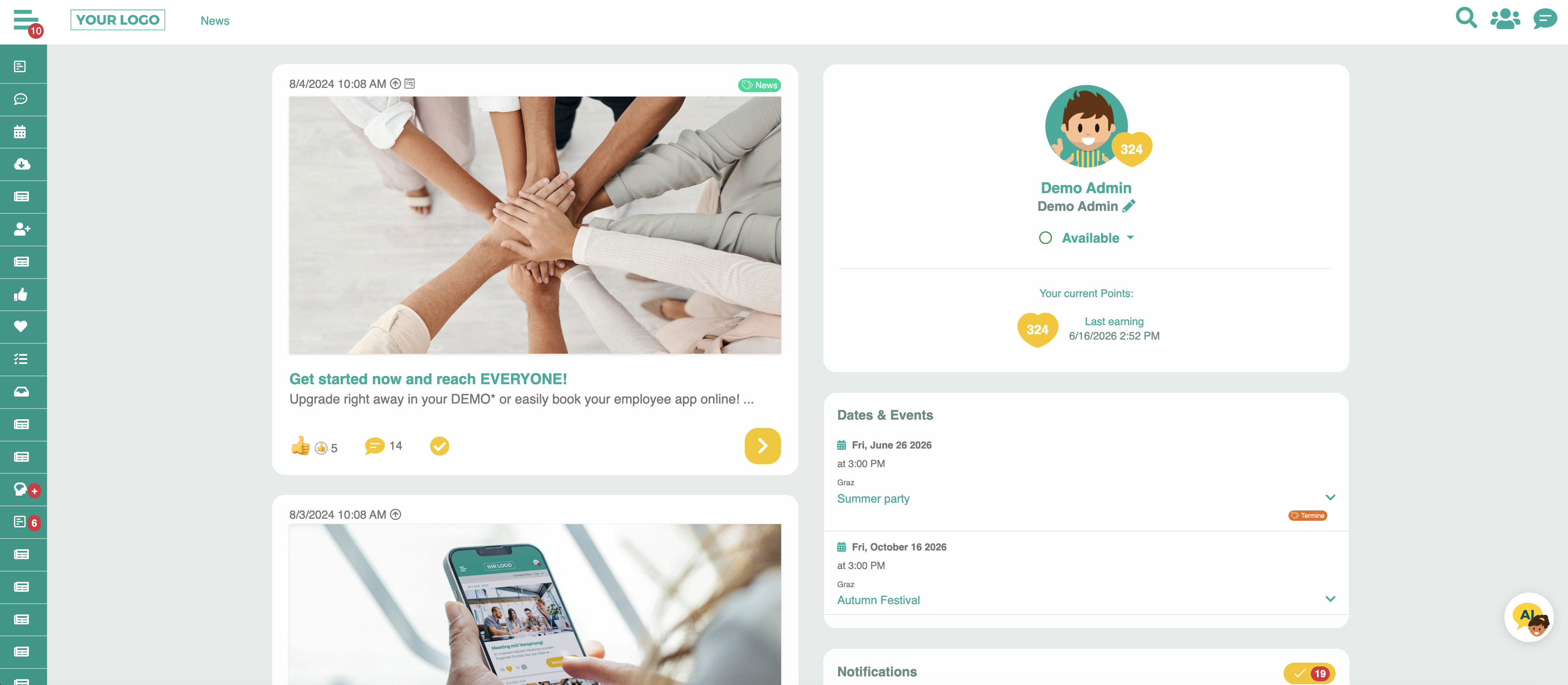
Example: On this news page, we have chosen the left alignment layout. To arrange dashboard elements to the right of it, we set them to the right:
In the user area:
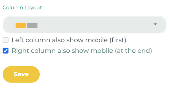
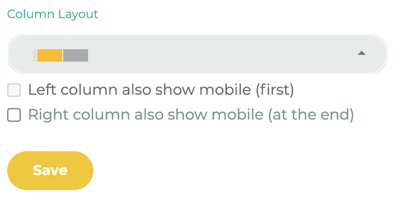
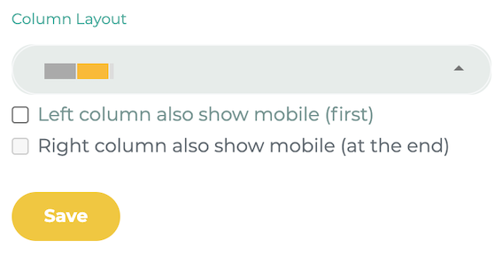
¶ Mobile
With the layouts, you can define that elements, which were otherwise only available for the desktop, are also displayed when the page is viewed on a mobile device. Check the box Column also show mobile: